
Track a compact, balanced set of 10 to 18 KPIs spread across seven categories, then run each one through the MOTA filter (Measurable, Owned, Timely, Actionable) before it earns a spot on the dashboard. Cap the whole thing at a moderate number of metrics suitable to avoid overload. Below you'll find the category-led KPI menu with formulas and benchmarks, a copyable dashboard template, and a 90-day implementation checklist.
TL;DR:
- Choose only 10 to 18 KPIs across throughput, quality, utilization, cost, speed, reliability, and people, focusing on those that reveal current constraints.
- Pair throughput metrics with corresponding quality metrics to prevent overestimating progress from cycle time improvements alone.
- Apply the MOTA filter—measureable, owned, timely, actionable—to ensure KPIs drive decisions rather than just look good on reports.
- Limit dashboards to 15 to 20 metrics, structure them into five sections with specific ownership, and review at distinct cadences to maintain clarity and trust.
- Use automated, real-time data mapping platforms like Oak & Nine to reduce manual effort, provide early alerts, and sustain KPI discipline over the long term.
Table of Contents
- Which operations KPIs matter most, by category
- How do you choose the right KPIs and avoid vanity metrics?
- How should you design an operations dashboard that people actually use?
- Turning KPI selection into a working dashboard in 90 days
- A compact dashboard template you can copy today
- Why Oak & Nine helps operations leaders make KPIs work
- Why most KPI programmes quietly die within a year
- Oak & Nine: closing the gap between dashboard and decision
- Sources
Which operations KPIs matter most, by category
Most operations dashboards fail for the same reason: they try to measure everything, so nobody trusts anything on them. The fix isn't more metrics. It's picking two or three per category and making sure each one exposes whatever is currently constraining performance. A well-built dashboard picks two to three metrics per category across throughput, quality, utilisation, cost, speed, reliability, and people, landing at roughly 15 to 20 metrics total.
Here's the catalogue, organised the way most operations leaders actually think about their business.
Throughput measures how much flows through your system and how fast. Cycle time is the elapsed time from when work starts to when it finishes: Cycle Time = End Time − Start Time. Lead time adds the wait before work even starts: Lead Time = Time of Delivery − Time of Request. Work in progress (WIP) counts open items at any given moment, and throughput rate is simply units completed per period. A manufacturing line running well typically sees cycle time flat or falling month over month; a rising WIP count with flat throughput is the classic sign of a bottleneck forming upstream. If you've never traced where flow actually breaks down, finding the bottleneck in a process is worth doing before you finalise which throughput metric to track.
Quality catches the defects that throughput numbers hide. First-pass yield (FPY) is the percentage of units that pass inspection without rework: FPY = (Units Passing First Time ÷ Total Units Started) × 100. Error rate and rework ratio follow the same logic in reverse. Benchmark guidance from operational excellence research puts FPY targets around 90%+ for knowledge work and 95%+ for manufacturing. Track quality against throughput, never on its own. A cycle time improvement that quietly tanks FPY isn't an improvement.
Utilisation tells you how much of your available capacity is actually being used. Capacity utilisation is (Actual Output ÷ Maximum Possible Output) × 100; billable utilisation swaps in billable hours over available hours for service teams. The sweet spot for utilisation lies within a moderate range; pushing utilisation too high for a sustained period can lead to burnout, quality issues, and no slack to handle demand spikes. This is one of the most misused metrics in operations because higher always looks better on a slide, right up until it isn't.
Cost metrics matter more as trends than as absolutes. Cost per unit (Total Operating Cost ÷ Units Produced) and OpEx ratio (Operating Expenses ÷ Revenue) tell you far more when charted quarter over quarter than as a single snapshot. A cost to serve analysis will show you which customer segments or product lines are quietly eroding margin behind an average that looks fine.
Speed metrics measure how quickly you respond and deliver. Time-to-resolution, time-to-onboard, and order fulfilment cycle time all follow the same shape: measure from trigger event to completion, and watch the distribution, not just the average, since a handful of slow outliers can hide inside a healthy mean.
Reliability covers SLA attainment (percentage of commitments met on time), mean time to repair (MTTR), and mean time between failures (MTBF). Recommended thresholds vary by industry, but SLA attainment significantly below typical high standards for customer-facing commitments usually warrants investigation.
People metrics round out the set: employee Net Promoter Score (eNPS), regrettable attrition (voluntary departures you didn't want), and revenue per employee. These move slowly, so quarterly tracking suits them better than weekly.
| Category | Example KPI | Formula | Typical benchmark |
|---|---|---|---|
| Throughput | Cycle time | End time − start time | Falling trend, context-specific |
| Quality | First-pass yield | (Units passing first time ÷ total started) × 100 | 90%+ knowledge work, 95%+ manufacturing |
| Utilisation | Capacity utilisation | (Actual output ÷ maximum output) × 100 | 90%+ |
| Cost | OpEx ratio | Operating expenses ÷ revenue | Trend over absolute value |
| Speed | Time-to-resolution | Resolution time − trigger time | Sector dependent |
| Reliability | SLA attainment | (SLAs met ÷ total SLAs) × 100 | 95%+ for customer-facing |
| People | Regrettable attrition | (Regrettable departures ÷ headcount) × 100 | Falling trend, quarterly review |
Pro Tip: Pair every throughput KPI with a quality KPI on the same view. Cycle time improving while FPY quietly drops is the single most common way operations teams fool themselves into thinking they've made progress.
How do you choose the right KPIs and avoid vanity metrics?
Selection is where most dashboards go wrong, usually by including whatever's easiest to pull from existing reports rather than what actually drives a decision. The MOTA filter forces a cleaner test: a KPI only earns dashboard space if it's Measurable, Owned by a named person, Timely enough to act on, and Actionable when it moves.
Beyond MOTA, run every candidate metric through three quick questions:
- If this number moved 20%, would someone change what they're doing? If the honest answer is no, it's a vanity metric regardless of how impressive it sounds in a board deck.
- Does a specific person own this number, with their name attached to it, not a department?
- Can you get fresh data on this weekly? Quarterly data can't drive weekly decisions, no matter how important the underlying concept is.
Vanity metrics tend to share a family resemblance: they measure activity rather than outcome. Common substitutions worth making immediately:
- "Tickets resolved" becomes tickets resolved right first time, since raw volume rewards speed over accuracy.
- "Hours logged" becomes billable utilisation against a target range, since hours alone say nothing about value delivered.
- "Website visits" becomes qualified pipeline generated, since traffic without conversion tells you almost nothing operationally.
- "Emails sent" becomes response rate within SLA, since output volume ignores whether the output worked.
The deeper trap here is Goodhart's law: any metric that becomes a target eventually gets gamed, sometimes without anyone intending to game it. The defence is pairing. Never track a speed metric without a quality metric alongside it, and never track a cost metric without a service-level metric beside it. Set thresholds that trigger action rather than observation. A red threshold should mean "someone picks up the phone today," not "we note this in next month's report."
How should you design an operations dashboard that people actually use?
Design discipline matters more than most teams admit. A dashboard readable in under three minutes gets checked daily; one that takes fifteen minutes to parse gets opened once a month, if that.
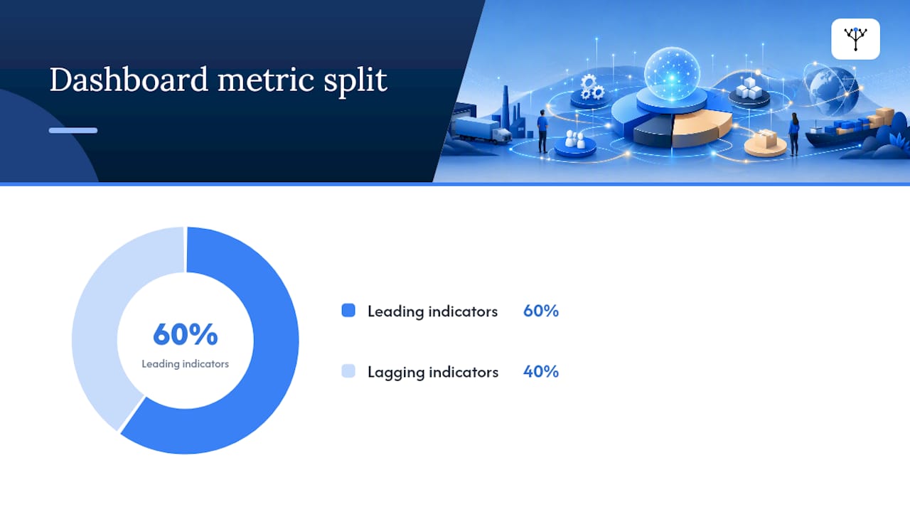
The core rules are simple to state and hard to follow: cap the dashboard at 15 to 20 metrics total, aim for roughly a 60/40 split between leading indicators (WIP, pipeline, capacity utilisation) and lagging indicators (revenue, attrition, cost per unit), and if it takes longer than three minutes to read, cut metrics or push detail into a drill-down layer.
An operating dashboard split into five clear sections, each with a named owner and a defined update cadence, is what separates a dashboard people trust from one they ignore.
Structure the layout into five sections that mirror how a COO actually thinks about the business:
- Revenue health: bookings, pipeline coverage, churn.
- Cost and margin: OpEx ratio, cost per unit, gross margin trend.
- Customer operations: SLA attainment, first-pass yield, time-to-resolution.
- Go-to-market efficiency: lead velocity, cost per acquisition, conversion rate.
- People and capacity: capacity utilisation, eNPS, regrettable attrition.
Each section needs its own cadence. Frontline metrics like WIP and SLA breaches need daily or real-time visibility. Section owners review their numbers weekly. Trends get discussed monthly at the leadership level, and the full KPI set gets a strategic review quarterly, when it's time to ask whether each metric earned its place.
Turning KPI selection into a working dashboard in 90 days
Moving from a spreadsheet of ideas to a functioning dashboard takes discipline more than time. Following a structured rollout over three weeks, with a 90-day checkpoint, keeps the project from stalling in endless debate about which metrics matter most.
- Week 1, select and assign. Choose your 15 to 20 metrics using MOTA, name an owner for each, document the exact formula, and set green/yellow/red thresholds before anyone starts collecting data.
- Week 2, build and baseline. Pull historical data to establish where each metric currently sits, validate that your data sources are accurate and refresh on schedule, and build the dashboard view itself.
- Week 3, review and adjust. Run the first weekly operational review, watch which metrics actually generate discussion, and adjust thresholds that trigger too often or not at all.
- Day 90, filter. Ask which metrics changed a real decision in the last quarter. Anything that didn't gets replaced.
Action triggers need to be explicit from day one.
Pro Tip: Write the escalation path into the dashboard itself, next to the threshold. A red number with no defined next step just sits there generating anxiety instead of action.
A compact dashboard template you can copy today
Here's a working template with roughly 15 metrics, ready to adapt. Swap the benchmark column for your own industry figures once you've run a 90-day baseline, since sector norms vary more than any generic guide can capture.
Pair cycle time with first-pass yield on the same screen, and pair SLA attainment with MTTR. When a breach appears, tracing the bottleneck upstream rather than reacting to the symptom alone tends to reveal the actual root cause faster.
- Customise every threshold to your own 90-day baseline, not a generic industry figure.
- Review the full template quarterly and drop any row that hasn't triggered a decision.
- Keep formulas visible on the dashboard itself so owners never have to ask "how is this calculated?"
Why Oak & Nine helps operations leaders make KPIs work
Building the dashboard above by hand, in spreadsheets pulled from four different systems, is exactly the kind of manual work that quietly kills KPI programmes within a quarter. Oakandnine's platform maps your organisation's processes, systems, and people into one live model, so the metrics above pull from connected data rather than someone's weekly export ritual.
That matters most at the moment a threshold breaches. Instead of an operations manager manually cross-referencing three tools to find out why SLA attainment slipped, Oakandnine's real-time insights and preemptive alerts flag the constraint before it shows up as a red number three weeks later.
- Live org mapping keeps KPI ownership and formulas tied to the actual process, not a static document.
- Preemptive alerts catch threshold breaches before the weekly review, not after.
- Automated data unification removes the manual reconciliation that eats into the 90-day rollout above.
Explore how Oakandnine connects the functions behind your dashboard, or see the platform built for operations leaders directly.
Why most KPI programmes quietly die within a year
Most KPI programmes don't fail because the metrics were wrong. They fail because nobody owned the weekly discipline of reviewing them, adjusting thresholds, and actually acting on a red number. Start with fewer metrics than you think you need, expand only once a KPI has demonstrably changed a decision, and treat the quarterly filter as non-negotiable, not optional housekeeping.
— Ronan
Oak & Nine: closing the gap between dashboard and decision
Oakandnine is the alternative to stitching together spreadsheets, BI tools, and manual exports every week. It maps your operations into a single live model, so the KPIs you've just built get real-time data and preemptive alerts instead of a monthly scramble to reconcile numbers before the leadership review.
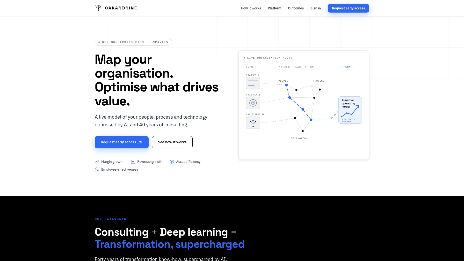
Where most operations teams lose weeks rebuilding thresholds after every system change, Oakandnine keeps the dashboard connected to the underlying process automatically. A margin squeeze in one region, a capacity bottleneck on one line, an SLA breach in one team all surface before they compound into a quarterly problem. If you're responsible for turning the KPI framework above into something your team actually checks daily, visit the page built for operations leaders and request a walkthrough of how the platform maps to your existing dashboard.
Sources
- KPIs That Operations Leaders Actually Track (And Why) | APFX
- Operating Dashboard Template: Sections, Metrics &...
- Operational Excellence KPIs (OpEx) Measuring and Monitoring
- How to strengthen your organization with operational KPIs