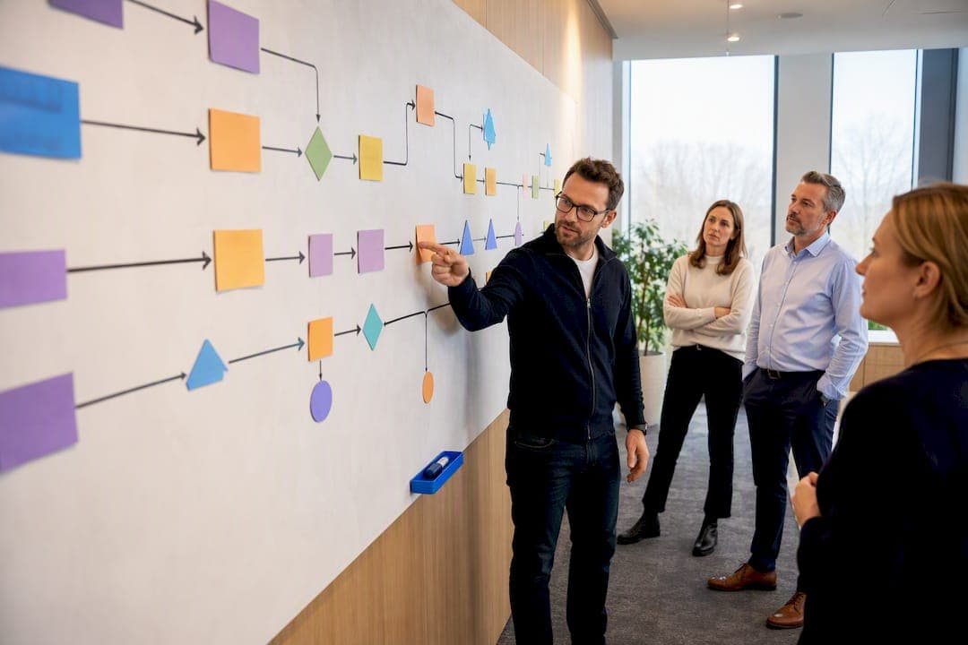
Value stream mapping is a visual lean method that traces every step, delay, and handoff needed to deliver a product or service, so a team can see where time and effort genuinely add value and where they don't. Its immediate payoff is exposing waiting and rework hidden inside a process that looks fine on paper. Then translating that visibility into a future-state design and a concrete action plan. Operations leads and process owners get the most from it, because they carry both the authority to act and the metrics to prove whether the change worked.
TL;DR:
- Proper scope is critical: mapping a single product family or transaction yields actionable insights, whereas broad maps become cluttered and less useful.
- Key metrics like flow efficiency below 5% are common in admin processes, but targeted changes such as batching or better scheduling can realistically raise it into the mid-teens.
- Follow-up and continuous monitoring via a business management platform is essential to prevent revert to the current state and maintain improvements.
- Effective VSM workshops are brief, focused, and result in concrete action plans with owners and deadlines to ensure lasting impact.
Table of Contents
- When should you use value stream mapping?
- Essential VSM symbols and what to record on the map
- How do you run a VSM workshop from current state to action plan?
- What metrics matter, and how do you calculate them?
- A worked example: cutting a loan application's dead time
- What mistakes derail a VSM initiative?
- Oak & Nine perspective: keeping the future state live
- How Oak & Nine helps you hold the future state
- Sources
When should you use value stream mapping?
Value stream mapping earns its place wherever a repeatable process moves a product, service, or piece of information through multiple hands. That covers far more ground than the factory floor it was born on. Atlassian's overview of the method points to software delivery pipelines, and the same logic holds for loan processing, patient intake, and invoice approval chains.
The first real decision is scope. Map too broadly and the diagram becomes unreadable; map one specific product family, service line, or transaction type, and the picture stays sharp enough to act on.
A value stream map goes further than a standard process map by attaching hard numbers, timelines, and information flow to every step rather than just naming the step.
- Manufacturing: physical parts moving through cutting, assembly, and packaging
- Services and admin: applications, claims, or requests moving through approval stages
- Software: code moving from commit to deployment through review and testing gates
- Cross-functional processes: work that crosses department lines, where handoffs cause most of the delay
Essential VSM symbols and what to record on the map
A value stream map uses a compact, standardised visual language, and Wikipedia's reference on the notation sets out the core set. A process box represents a single step. An inventory triangle marks work piling up between steps. Solid arrows show material flow; dashed or lightning-bolt lines show information flow, including electronic scheduling signals. Separate icons denote the customer (usually top right) and supplier (top left), since a value stream always runs between the two.
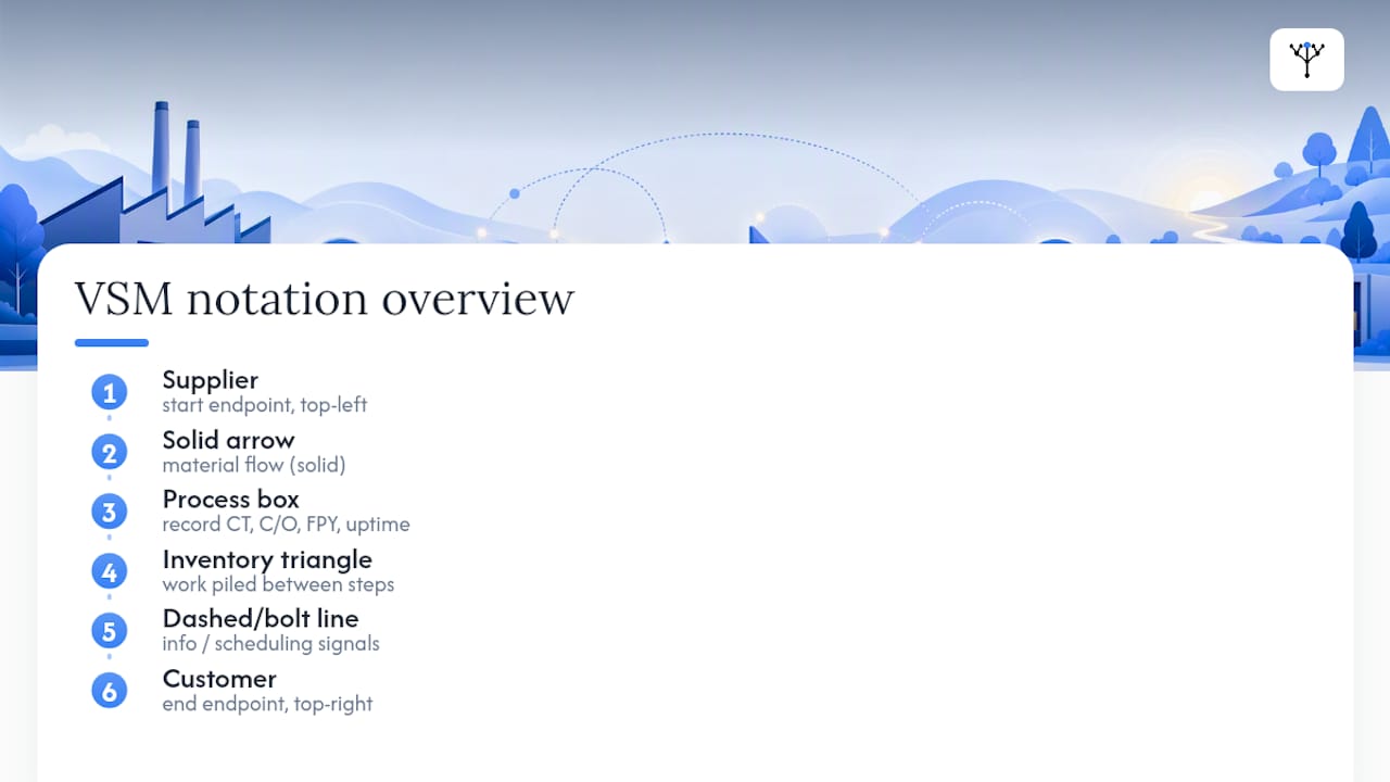
Inside or beneath each process box, you record four figures that make the map measurable rather than decorative: cycle time (CT), changeover time (C/O), first pass yield (FPY), and uptime.
Statistic: Purdue's Lean Six Sigma programme cites a real process study where a loan application carried 36 working hours of total lead time against just 1 hour of value-added work, a flow efficiency of roughly 2.8%. That gap between total time and value-added time is exactly what the symbols and data boxes are built to reveal.
Beneath the process boxes, a timeline runs along the bottom of the map, stepping between value-added time (the peaks) and wait time (the valleys). Adding every peak gives total value-added time; adding every valley gives total lead time, and dividing one by the other gives flow efficiency.
How do you run a VSM workshop from current state to action plan?
A focused VSM event follows a sequence laid out in the lean classic Learning to See, and it works because each step forces the team to earn the next one with real evidence rather than assumption.
- Select the product family and the team. Pick one product, service line, or transaction type, not a whole department's output. A team of five to eight, mixing frontline staff with a process owner and a facilitator, tends to surface both the technical detail and the authority to change it.
- Go to the gemba. Walk the actual process, not the org chart version of it. Time each step with a stopwatch rather than relying on memory or a written procedure, because estimated cycle times are consistently optimistic against measured ones.
- Draw the current-state map. Sketch it by hand first, using the standard symbols, and populate the timeline with your measured cycle times, wait times, and inventory counts. Calculate total lead time, total value-added time, and baseline flow efficiency before moving on.
- Identify kaizen bursts. Mark the specific points on the current-state map, usually with a starburst symbol, where waste is worst: excess inventory, long changeovers, poor first pass yield, or unclear information flow.
- Design the future-state map. Redraw the process as it should run, addressing each kaizen burst with a specific change: pull systems, standardised work, reduced batch sizes, or better scheduling signals.
- Build the action plan. Break the future state into discrete initiatives, each with a named owner, a deadline, and a measurable KPI tied back to the metrics on the map.
Pro Tip: Time the process twice, once in the morning and once in the afternoon, before you trust a cycle time. Volume and staffing shifts through the day skew a single reading more than most teams expect.
A tightly run event typically spans two to three days and produces three deliverables: a validated current-state map, a future-state map, and a prioritised action plan with dates attached. Anything longer usually signals the scope crept beyond one product family.
What metrics matter, and how do you calculate them?
Five figures carry the weight of a credible value stream map, and each has a precise formula rather than a rough feel.
| Metric | Formula | What it tells you |
|---|---|---|
| Takt time | Available working time ÷ customer demand | How fast you must produce to match demand, used to size capacity |
| Cycle time (CT) | Time to complete one unit at one step | Whether a step can keep pace with takt time |
| Lead time | Total elapsed time from request to delivery | The full customer-experienced wait, including all queues |
| First pass yield (FPY) | Units completed correctly first time ÷ total units started | How much rework is inflating lead time |
| Flow efficiency | Value-added time ÷ total lead time | The proportion of lead time actually spent adding value |
Changeover time deserves its own attention during gemba observation. Measure it as the gap between the last good unit of one batch and the first good unit of the next, not the scheduled changeover window, since the two rarely match. A flow efficiency below 5% is common in unimproved admin processes, and moving into the mid-teens is a realistic short-term target once early waste identified in the mapping exercise is addressed rather than an aspiration to chase immediately.
A worked example: cutting a loan application's dead time
The loan application referenced earlier is worth walking through in full, because it shows exactly how a poor flow efficiency figure translates into fixable steps rather than an abstract complaint about slowness.
- Current state: 36 working hours of total lead time, 1 hour of genuine value-added work, giving flow efficiency of roughly 2.8%. Almost every hour on the clock is queue time, not processing time.
- Where the waiting sits: mapping the timeline shows the bulk of delay accumulates between handoffs, applications sitting in a queue waiting for the next reviewer to pick them up, not during the actual underwriting or document checks.
- Future-state changes: batching applications into smaller lots to shorten queue time, giving underwriters a shared real-time queue view instead of an email inbox, and setting a same-day service-level target for each handoff stage.
None of those three changes touches the actual skill or speed of underwriting. They target the gaps between steps, which is precisely where a value stream map points a finger that a standard process flowchart usually misses.
What mistakes derail a VSM initiative?
Most VSM efforts that stall do so for the same handful of reasons, and nearly all of them are avoidable with discipline rather than more training.
- Scoping too wide. A map covering an entire department instead of one product family becomes too cluttered to act on, a point the Learning to See workbook makes directly about early lean efforts.
- Guessing instead of measuring. Cycle times pulled from memory or a written SOP routinely understate reality; a stopwatch at the gemba is what makes a map credible to the people who have to act on it.
- No named value-stream owner. Improvements agreed in a workshop room tend to erode within weeks if nobody is explicitly accountable for holding the new state, a risk the Lean Enterprise Institute's lexicon flags directly.
- Treating the map as the deliverable. The map is the diagnosis; the action plan with owners, dates, and KPIs is the actual output.
- No follow-up cadence. Without a review rhythm, a team drifts back toward the old current state within a quarter.
Pro Tip: Put a review date for the action plan on the calendar before the workshop ends, not after. A plan without a follow-up meeting booked tends to quietly evaporate.
Oak & Nine perspective: keeping the future state live
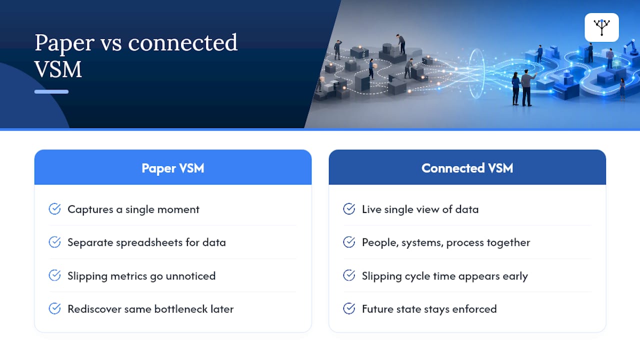
A paper value stream map captures a moment. The risk nobody talks about enough is that the moment passes, and three months later the current state has quietly reasserted itself because nothing was watching. Live data collection and predictive tracking turn a static future-state design into something that stays enforced, because the metrics that mattered in the workshop, cycle time, flow efficiency, first pass yield, keep flowing after the sticky notes come down.
That's the gap a connected organisational model closes. When people, systems, and process data sit in one live view rather than three separate spreadsheets, a slipping cycle time or a growing queue shows up before it becomes the next kaizen event's headline finding. The alternative, rediscovering the same bottleneck a year later, is far more common than most operations teams admit.
— Ronan
How Oak & Nine helps you hold the future state
A workshop can design a better process in two days. Holding that process in place for two years is the part most teams underestimate, because the spreadsheet trackers and shared drives that captured the action plan rarely survive contact with the next quarter's priorities. A business management platform exists for that gap: it connects the people, systems, and process metrics your VSM workshop just measured into one live view, so a cycle time drifting back upward or a queue rebuilding shows up as an alert, not a surprise six months later.
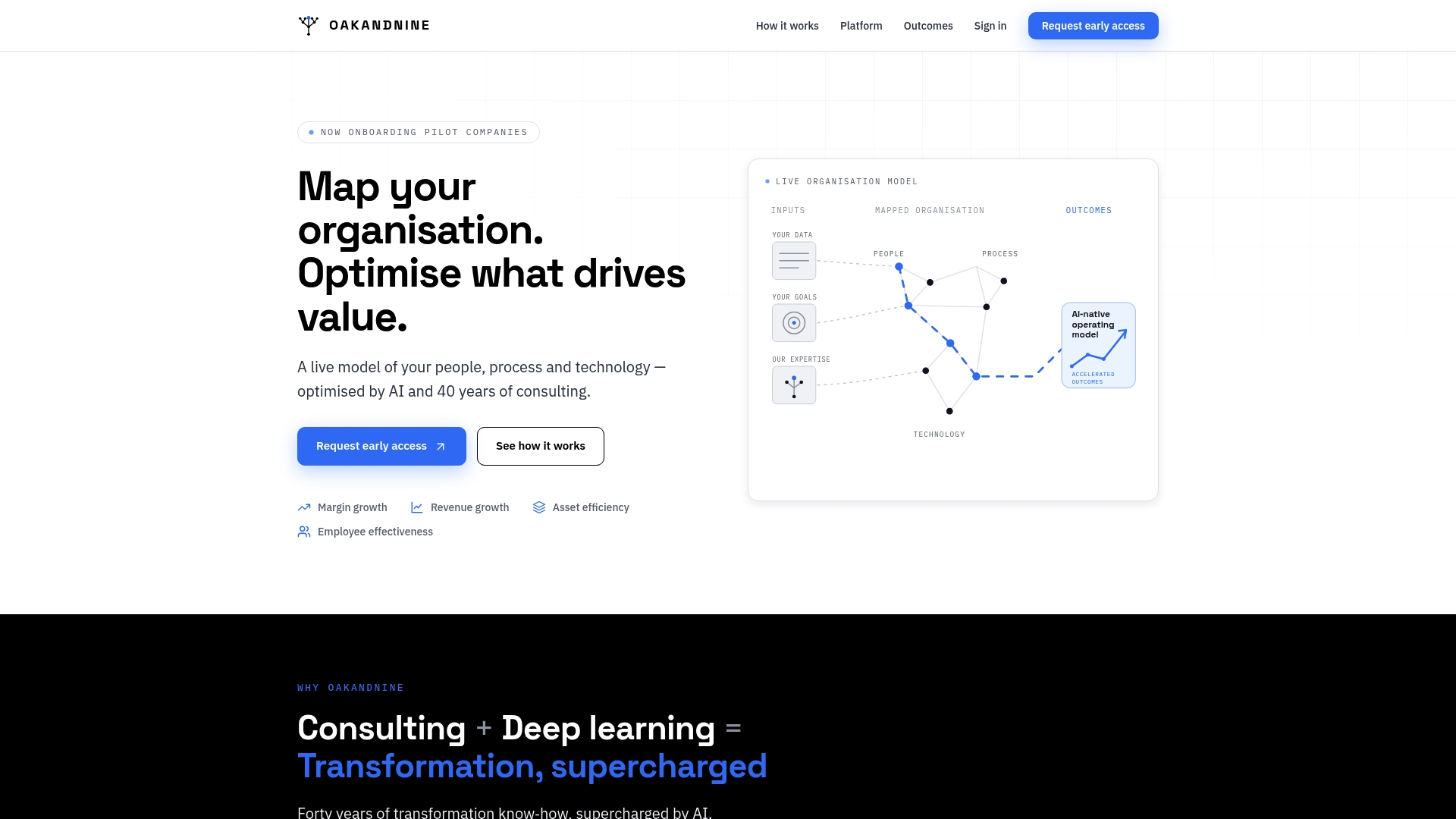
For manufacturing teams, that means real-time visibility into the exact metrics your current-state map already relies on: uptime, changeover, first pass yield. For operations leaders running service or admin value streams, the platform links the functions your map crossed so a handoff delay in one department is visible to the one waiting on it, closing the queue-time gap the loan application example above depended on. If your last VSM event produced a strong future-state design that's already slipping, book a walkthrough of Oak & Nine's operations platform and see what it flags in your own numbers within the first week.
Sources
- Learning to See, part 1 (Learning to See workbook)
- Value Stream Mapping: The Search for Adding Value and Eliminating Waste | Purdue Lean Six Sigma Online
- Value-stream mapping — Wikipedia
- What is Value Stream Mapping? Guide & Benefits | Atlassian